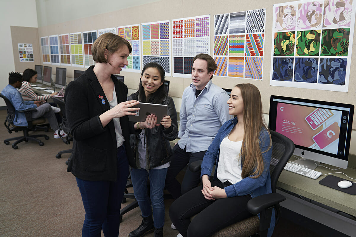
On the surface, the assignment for the interactive design class was straightforward: to craft a project related to medicine. But underneath was a greater goal: to learn how designers can collaborate with professionals from a totally different field.
“It taught the students how to design a project with the end user in mind, instead of individual preference,” said Instructor of Interactive Design Kelly Smith. “It tried to focus them on a problem, with a real person and a real objective: How do you do research, and then design a project to show what you have learned?
First, nursing students were asked to develop research for a chosen topic based on their clinical experience. They then partnered with interactive design students to design a tool that helped educate health care professionals and patients on the research they developed.
The end results were devised by the teams working together to leverage their strengths and come up with projects that neither team could have done on their own. They included a booklet about deep vein thrombosis, a website about bedsores, information about hypertension and a guide to focused relaxation.
There’s also a mobile app that Type 2 diabetes patients can use to track items like nutrition, exercise and medication to help maintain their blood sugar and overall health.
The projects were part of Smith’s UX/Ui class, standing for user experience and user interface. She wanted her students to come up with projects that were as useful as possible, without needless flourishes.
“That can be especially tough for students,” Smith said. “Their idea of design is to make it look good, but in my class, we talk about how it doesn’t matter how it looks if it doesn’t use the best practices. It can look super cool, but your grandmother doesn’t care if it looks cool. She needs to be told when to take the right medication at the right time. It’s an easy concept to understand, but is hard to master. The design students had to shift their brains to see things a little differently.”
New ways of seeing and understanding became important when teams from the two academic disciplines came together. The nursing students came up with the medical information; the design students put together the presentation package.
Students on both sides of that project say they learned a lot. “It was really eye-opening,” said design student Elizabeth Maya. “It gave me an opportunity to see what the real world is going to be like. I’ll have to collaborate with others who may or may not know anything about design.”
Added nursing student Julia Rector: “Through our collaboration, we came up with the idea to create what I would call Weight Watchers for Type 2 diabetes, where the user can track things and get rewarded with things like confetti, to add some interactive excitement on the screen.”
Once their team settled on Type 2 diabetes as their topic, Rector said, she and other nursing students performed what is called a PICO analysis – population, intervention, comparison and outcome – to determine what patients needed.
“We thought we were going to find out that medication or lifestyle would be best,” she said. “We found that the combination was best, which was interesting.”
Then Maya and her design team got more heavily involved. The design students decided that for an app to be useful and accessible for the older population they wanted to reach, it had to be user-friendly in terms of color, typeface, buttons, instructions and the size of the text.
The students agreed that the finished product met the goals that the assignment had set, as well as what they hoped to accomplish.
“I feel like we communicated really well,” Maya said. “All the nursing students were really supportive of what we chose in terms of design. I think we did a great job.”
“It was better than we thought,” Rector added. “We didn’t know what the app would end up looking like, though we knew the content was there. And today, if we really wanted to develop this app for consumers, I don’t think we would need to change a thing before making it live.”
